Websites should be akin to the proverbial pot of gold at the end of the rainbow. They should draw in customers and get them to spend big bucks.
But how often can you honestly say that that happens on your website? Do customers really just log on and start spending without a care in the world?
Almost always, they don’t. Instead, extracting cash from them often feels like trying to get blood out of a stone.
The primary problem here isn’t one of convenience or accessibility. Instead, it’s boredom. Dull websites turn users off like nothing else.
Therefore, in this post, we take a look at some of the reasons your audience remains unimpressed by your website, and what you can do about it.
Boring Choice Of Colours
While it might sound simple, colour choice is a major factor in determining website attraction and enjoyment.
You probably know this from your own experience. Grey and navy blue-themed websites hardly get you going, while bright orange and pink ones probably do.
Bad Typeface
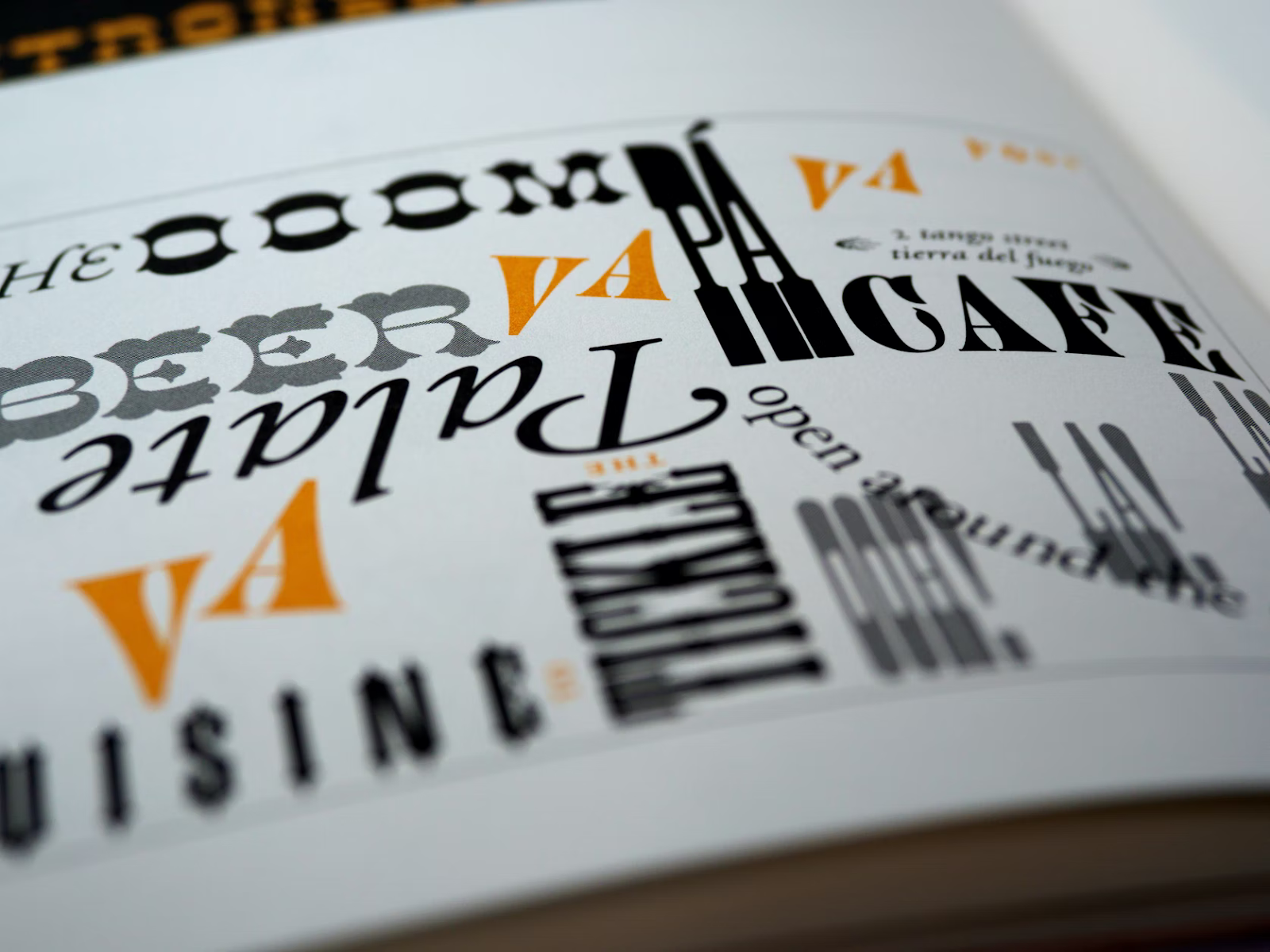
Another common visual issue is a poor typeface, according to medium.com. Many websites choose fonts that resemble human handwriting. However, these tend to be difficult to read and require visitors to strain and take their time to understand what you’re saying. As you might expect, the vast majority don’t bother and go elsewhere.
The most common internet fonts are sans-serifs. These are easy to read on a screen and audiences are used to them. Arials may look too austere, and Times New Roman may appear overly frilly.
Dull Content
Dull, repetitive content is another major issue. Nobody wants to read an article on your website that says something that they’ve read elsewhere. They want originality, passion and flair in what you do and say.
If you’re not much of a writer or you’ve struggled with SEO in the past, websites such as www.tonimarino.co.uk offer an alternative. Instead of penning all your content yourself, you get experienced professionals to do it for you. This way, you can take advantage of their turn of phrase and be more engaging for your audience at the same time.
Massive Blocks Of Text
None of the world’s most successful websites rely on massive blocks of text to sell themselves. In fact, simply presenting a bunch of people with a wall of text is one of the worst things that you can do on your website. It goes against convention and it can be hard to digest all of it.
Always break your text up into smaller chunks. Then go over your page content with a fine tooth comb, looking for any extra words or verbiage that you can remove without harming the meaning. Keep sentences as brief as possible and avoid using filler words.
There’s Nothing Individual About It
Lastly, your website could be suffering from a bad case of generic-itis. If it looks the same as everything else, then there won’t be anything that makes it distinctive in the minds of your audience.
Featured image: Unsplash – CC0 Licence
This is a contributed post